5 Top Trends in Web Design to Watch Out For
As we move further into 2022, it’s important to stay up-to-date on the latest trends in web design. In this blog post, we will discuss five of the top trends that are shaping the industry right now. Keep reading to learn more!
Text gigantism
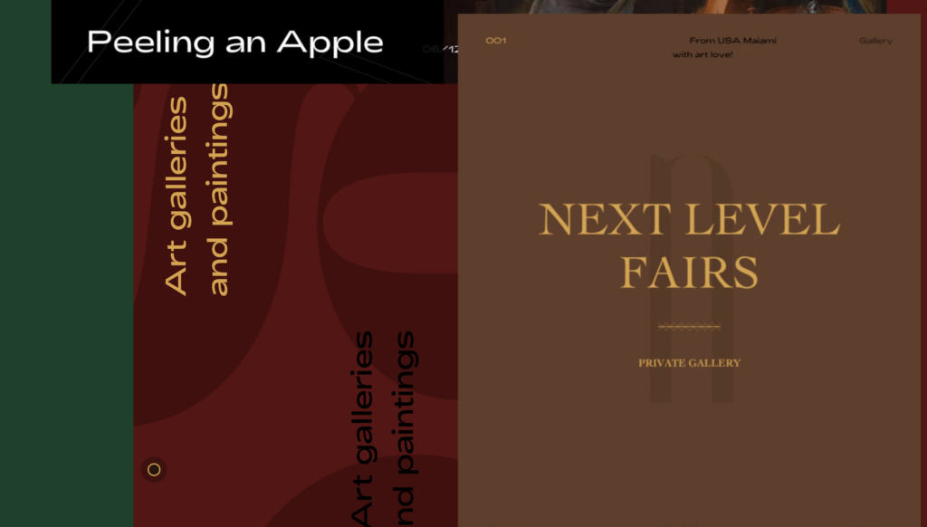
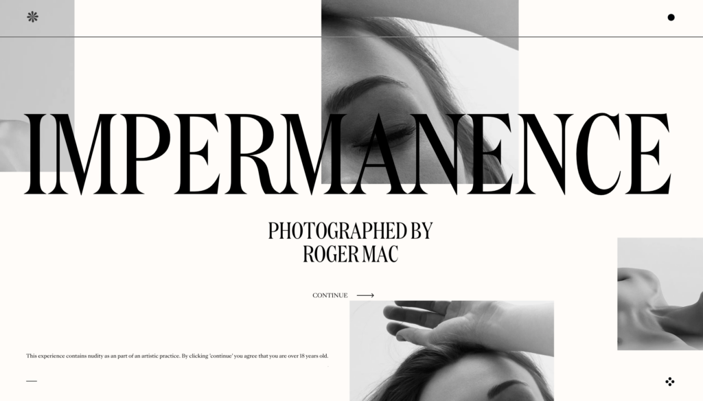
In recent years, there has been an increase in the use of large text on websites. This so-called “text gigantism” can be traced back to the rise of minimalist design trends. By using large, cleanly-designed fonts, web designers are able to create an impactful and visually-stunning effect. However, there is more to text gigantism than just aesthetics. Large text is also highly legible, making it easy for users to consume content on small screens. In addition, large text can help to draw attention to important information and call-to-actions. As a result, text gigantism is quickly becoming a staple of modern web design.
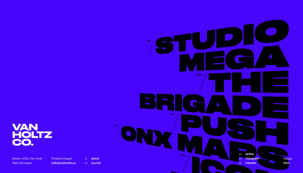
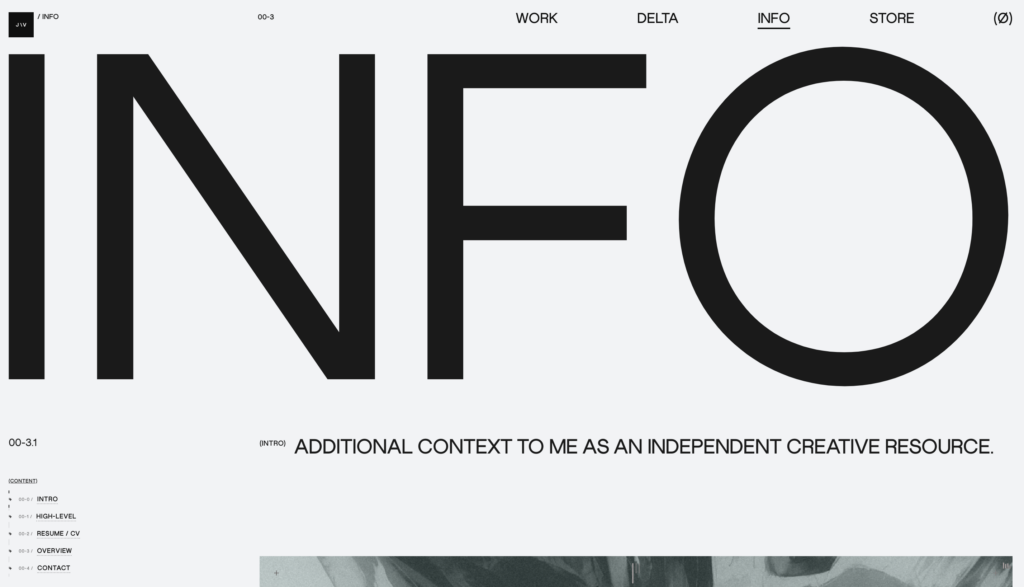
There are a few things to keep in mind if you’re considering using large text on your website. First, make sure that the font you choose is easy to read at larger sizes. Second, be aware of how the text will scale on different screen sizes. And finally, don’t forget to use small amounts of large text for maximum impact. When used correctly, text gigantism can be a powerful tool for your website.
Brutalism
For many web designers, the appeal of brutalism lies in its raw, unrefined aesthetic. Unlike other design styles that rely on precise forms and clean lines, brutalism designs embrace imperfection and chaos. This rough-around-the-edges look can give websites a sense of raw energy and vitality, making them stand out from the sea of cookie-cutter sites. Of course, designing a successful brutalist website requires a strong understanding of the style’s principles. Otherwise, the resulting site may simply appear unfinished or sloppy. When used effectively, however, brutalism can be a powerful tool for creating unique, provocative websites.
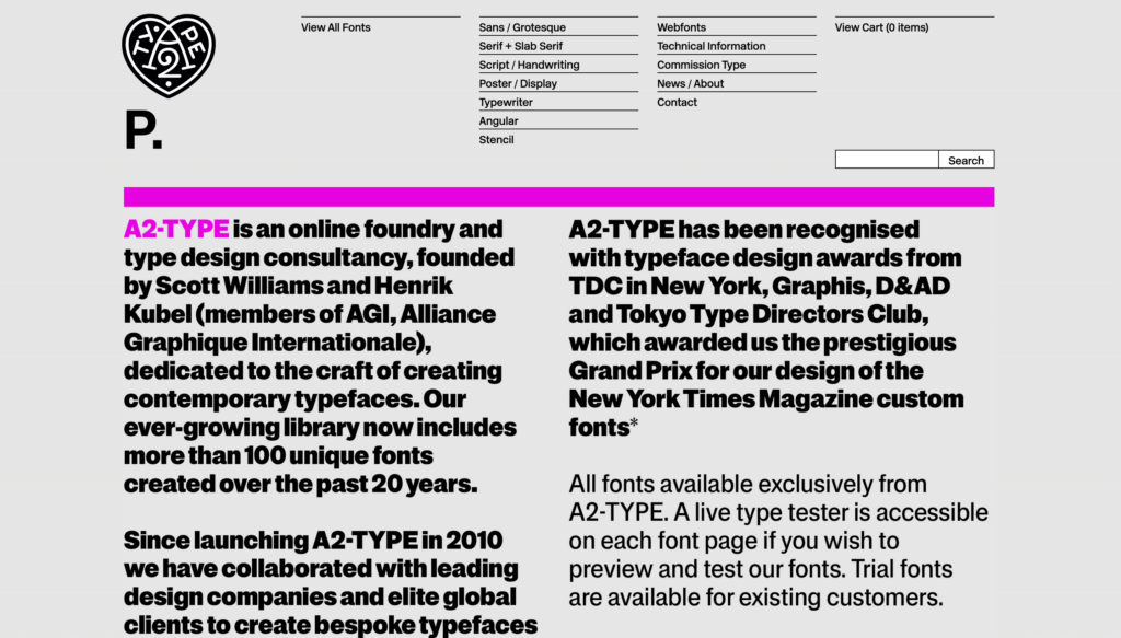
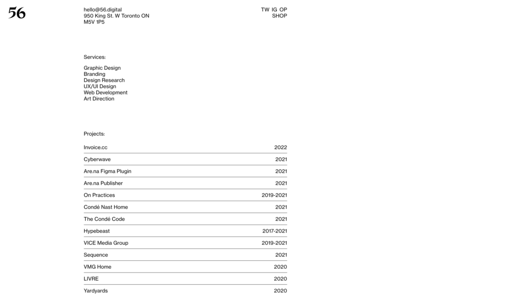
So, what is brutalism? As we mentioned, it’s a design style that values raw energy and imperfection. This aesthetic is achieved through the use of rough textures, bold colors, and irregular shapes. In many cases, designers will also incorporate found objects or unexpected elements into their work. The goal is to create a website that looks and feels alive, as opposed to the sterile, cookie-cutter sites that are so common online.
Retro nostalgia
In a rapidly changing digital landscape, some web designers are looking into the past for inspiration. So-called “retro” designs harken back to simpler times, when personal computers were new and the internet was still a novelty. These designs often feature bright colors, simple geometric shapes, and childlike illustrations. Some say that these elements help to evoke a sense of nostalgia, which can be comforting in an increasingly chaotic world. Others argue that retro designs are simply outdated and fail to take advantage of modern web development techniques. Whatever the case may be, there’s no denying that retro website design is currently experiencing a resurgence in popularity.
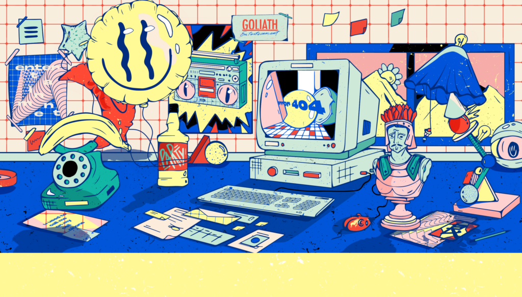
But retro designs are not without their critics. Some argue that these designs are simply outdated and fail to take advantage of modern web development techniques. Whatever the case may be, there’s no denying that retro website design is currently experiencing a resurgence in popularity. Who knows? Maybe it will help us to remember a time when things were simpler and the future was still full of possibilities.
Black and white
There are a lot of ways to make a website look good. You can use bright colors, large fonts, and exciting graphics. However, sometimes the simplest approach is the best. Black and white website design can be incredibly effective, particularly for businesses that want to convey a sense of sophistication and professionalism. The absence of color can also help to focus users’ attention on the content of the site. When used correctly, black and white website design can be both stylish and functional.
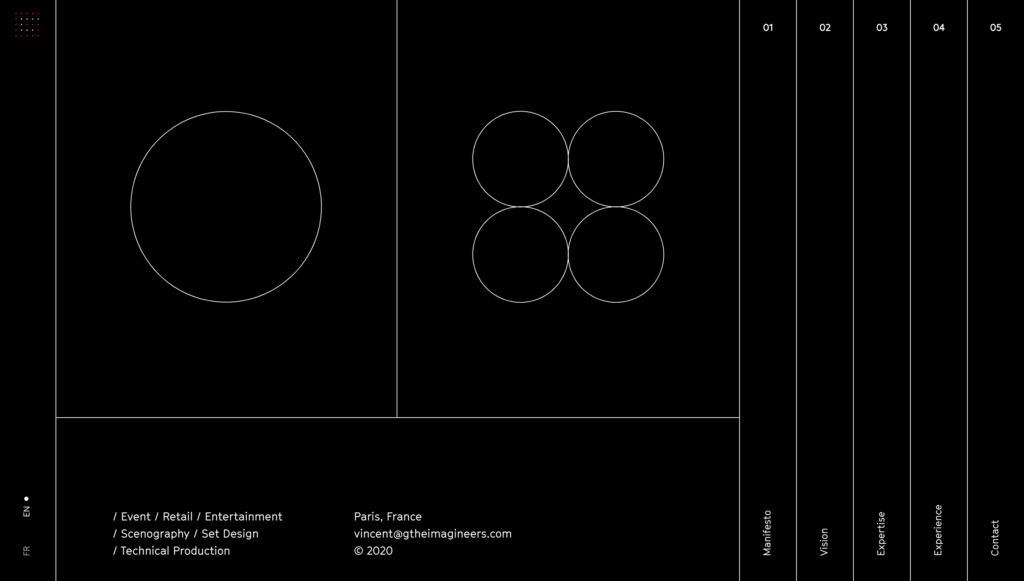
If you’re thinking of using black and white website design, there are a few things to keep in mind. First, it’s important to have a clear purpose for your site. What do you want users to do when they visit? Make sure that your content and navigation are designed with that goal in mind. Second, don’t be afraid to use white space. A black and white site doesn’t have to be cluttered or busy. In fact, the simplicity of the design can be one of its biggest strengths. Finally, remember that less is often more when it comes to black and white website design. A few well-chosen images and pieces of text can go a long way.
Acid colors
In recent years, there has been a trend towards using acid colors in website design. Acid colors are those that are bright, intense, and frequently neon. They can be very effective in attracting attention and creating an energetic feel. However, they can also be overwhelming and difficult to read. As such, it is important to use them judiciously. When used correctly, acid colors can help to make a website more eye-catching and memorable. However, when used too frequently or in the wrong context, they can create a feeling of visual clutter and confusion. As with all design choices, it is essential to carefully consider the use of acid colors before incorporating them into your website.
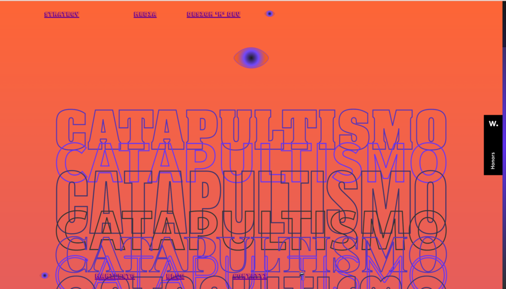
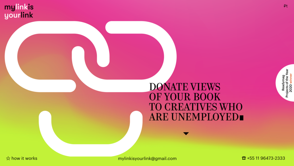
Some factors to consider include the overall tone and feel of your website, the colors of your branding, and the types of visitors that you are targeting. Acid colors can be a great way to add some visual interest and excitement to your website. However, it is important to use them in moderation and to make sure that they complement the rest of your design. With a bit of thought and planning, you can use acid colors to great effect in your website design.
These are just a few of the top trends in web design right now. As you can see, Text gigantism, brutalism, acid colors, black and white, and retro nostalgia are all key players. Keep these trends in mind as you plan and build your own website! Thanks for reading.
If you want a new website or optimize an existing one, contact us, and we will make any design according to the latest trends.


